If you close the Results dialog, you get a look at the Kappa Graph, which offers you a full graphical view on the pairs found by the Kappa routine, providing you with the chance to really understand the resulting Kappa value. The Kappa Graph shows you the matches as well as the errors found by INTERACT.
Note: Even if your Coding system is not suitable for calculating Kappa, you can use this graph to present a graphical comparison between two raters!
The Kappa Graph window is opened automatically, but might be hidden behand the Results window.
▪To get a full view on the graph, close the Kappa Results window.
The chart shows all Codes and Classes from the first DataSet of both documents, like this:
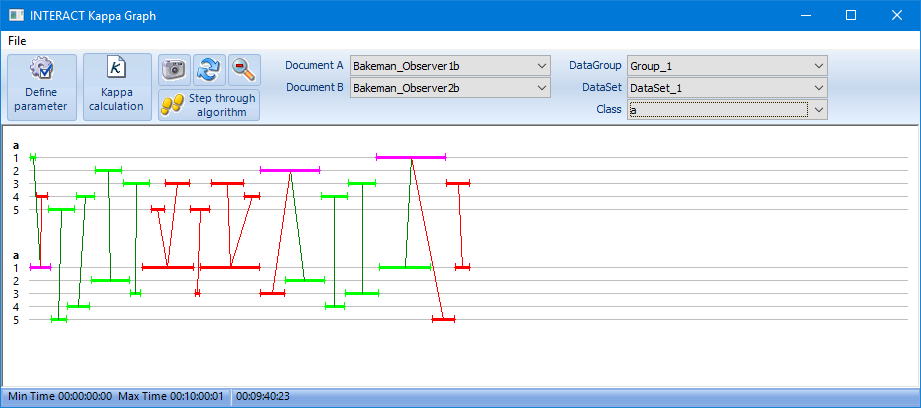
In this example, the name of the class is just 'a' and the numbers 1, 2, 3, 4, 5 represent different Codes. Based on the pair finding routine, this graph shows you the results of all matches and mismatches in a colorful way:
•All found Pairs are green.
•All errors (=different Codes) are red.
•Codes that can be linked to a matching as well as to a different Code, are colored pink.
•Codes with no link at all (no pairs) are displayed in a soft blue and hardly visible.
Adjust Parameters
If the results to not match your expectations, adjustmenting the initial parameters might improve the situation. You can return to the Kappa Parameters dialog from within the Kappa Graph dialog:
▪Click Define parameter to return to the Kappa Parameters dialog.
Visible data
This Kappa Graph, is a very unique and helpful tool to inspect the results of the pair-finding routine, in a visual way:
•What document is considered the 'leading' document can be changed using the drop down lists for Document A and Document B
•To keep this Chart readable, the Kappa Graph automatically shows you just one Class from one DataSet, as selected in the upper fields for Group/Set and Class, for the two selected documents.
•You can select other Classes and/or DataSets, as well as documents from the drop down menus in the upper part of the graph window, to inspect the results closely.
•Dragging with your mouse over a particular area zooms into that part, for easier identification.
•Use the ![]() icon to return to full view.
icon to return to full view.
Time Information
•Moving your mouse over the data, shows you the corresponding time information at the bottom of the dialog.
•In the lower part of the graph window, you see the lowest time code value as well as the highest time code value, found in those documents. This information is displayed to indicate the duration covered by the graph.
•Double-click a colored Event, to jump to the corresponding Event in the original data-file, allowing you to easily check what is right.